Monday, 15 October 2012
Wednesday, 10 October 2012
Reason for Title:
I decided to go with the title of a singular word "Transform" rather than dabble with a sentence.
The word transform is very literal and straight to the point, so from the beginning you're expecting to see change and that's exactly what my film does.
With the use of animation and lighting, my object changes form; various objects and shapes are created and overlapped, which are then emphasized by the strong contrast of light and dark.
NEW MUSIC
My friend, Jordan Seaward, has composed a sound track to go alongside my film and I think he's done a pretty good job!
Here we have an updated version of my movie clip, equipped with the new sound, new clips of unfolding shapes and perhaps an ever better ending!
-I think a few more minor adjustments and this clip will be complete!
Changes!?
This is another initial clip to play around with cuts and edits between my two movies (Each half is a different movie to make the animation easier on myself.)
However it was suggested that there should be some camera views that show my shape unfold..
-I have tried to find some really good shots of this to incorporate into my movie.
-Also this is terrible quality, I need to sort out my exporting file...
Saturday, 6 October 2012
Title..
Have also been thinking about a title for my movie:
Transform
I want to have blocks, all side on, that then rotate into letter forms, foreshadowing the events to come :D
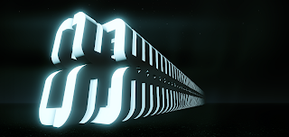
The sketchup model of the letters
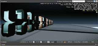
A screen capture as they rotate with light
Initial Storyboard
Just a quick wee sketch of how I may want my movie to 'unfold'
Showing how the camera will move and what lights could potentially show.
Wednesday, 3 October 2012
Fraps!
After much storyboarding (which I am yet to upload) I started to record different views of my model as it unfolds. Cutting and clipping will be essential to fully show off my model so I started to play around with some today.
I'm really liking some parts of my film - but others are still a bit iffy.
- It jumps occasionally, I need to smooth out the transitions
-Not sure if I like the light and dark sequence at the beginning.
I'm really liking some parts of my film - but others are still a bit iffy.
- It jumps occasionally, I need to smooth out the transitions
-Not sure if I like the light and dark sequence at the beginning.
Friday, 28 September 2012
Animation Test
Moving on with animation, wanted to show a friend who could potentially compose some music to go alongside.
Here's a sneak peak.
Here's a sneak peak.
100 Words
After experimenting with animation for hours,
I finally managed to animate 4 entities from a single point to create a bigger
object. This is exciting as I want my model to unfold from a single object and
expand!
I want my film to be dark and lit by selective
lights that will enhance my object by contrasting the light and darks that
should create intriguing patterns – as seen from interim images. I haven’t
thought too much about music yet, but I want it to be eerie and full of suspense.
Crazy Flowgraphs!
I started my flowgraph and animation again, this time knowing what I was doing. This time round, everything had to be precise - not just looking right.
This image here shows 8 entitys and 4 tag points - however when you start only 1 is visible.
I tried to be neat and tidy with my flow graphs.
One drop down menu shows the different entitys I hide and the second shows the different movements.
One drop down menu shows the different entitys I hide and the second shows the different movements.
6 various flowgraphs later and bam! This contraption unfolds.
Even my dude was in disbelief and took his binoculas off to see.
- Next step, multiply - a lot.
Wednesday, 26 September 2012
Rotate Around A Tag Point
After hours of trying to figure out how to rotate around a point, success!!
First you must bring in a tag point from the roll-up menu under AI.
Then link your entity with the tag point (in this order.)
Then link your entity with the tag point (in this order.)
This makes your object connected to the tag point.
To move the object, you must animate the tag point!
Here's my flow-graph, rotating around 1 point :)
Initial Animation
Adding a spawnpoint!
Adding a key to remove weapons and HUD!
Start of the movement - 6 entitys and a light
End point
The flow graph proof :P
3 Images For Presentation
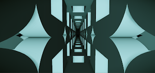
Three very different views from different aspects of my model(s).
I want to make my movie, or space, visually frightening with a sort of claustrophobic feel. Or even a never ending - no escape feel. I played around with the blue and orange lights - I love these colours against the dark background and the glow they create.
Wednesday, 19 September 2012
I'm liking where this is heading!!
Attempted some more views today! I'm really liking some of them... Now I have to choose 3 :\
3 Various views of a cool light pattern created
2 views playing with a blue/orange light contrast
Another view - playing with depth
Tuesday, 18 September 2012
D:
Goddamn, lost alot of my cryengine files on my USB - no idea why.
Lost one folder of terrain and mapping and one folder with my screenshots :(
Will have to redo some more damnit!
Lost one folder of terrain and mapping and one folder with my screenshots :(
Will have to redo some more damnit!
Friday, 14 September 2012
Cry Engine Screenshots
First week in and already had some difficulties with work disappearing.
But here is some screenshots, playing around in Cry Engine.

Getting my model into Cry Engine from Sketch Up.
Playing around with various scale and lighting effects.
Finding interesting views - relates back to initial drawing.
Adding water, just to see the effect it makes with light and reflection.
Sunday, 9 September 2012
Sketch Up Developments
Initially, I reworked various shapes of my final to recreate the depth and perspective feel while still maintaining the initial design principle; symmetry. I felt that this outcome was too similiar to that of project 1.
Again, I took a shape from my final to create that depth feeling - except this time I rotated the shapes from different view points to create something far more interesting. After repeating the model and relfecting parts I began to develop a model that is visually more appealing.
Assignment 2 : Initial Sketches
My favourite final is symmetry and I have chosen to develop this furthar for project 2. The view looks down towards an endless bottom, which creates an almost claustrophobic feel - something I will look to animate in cry engine - perhaps something like walls or surroundings moving in towards a centre point, creating an entrappment.
Tuesday, 14 August 2012
Entourage Finals
Note: All images used are royalty free, sourced from www.sxc.hu
Symmetry Final
I decided to leave this work in tact. I love the radiation of colour that overlays my pattern, this creates depth and the idea of an explosion. I added the birds to create a sense of depth, scale and to add some sort of meaning to the surrounding.
Rhythm / Repitition Final
I tried getting my hands on some of those old school 3D glasses so I could try and legitimately make this work 3D. Unfortunately was able to in time, however, this work still appeals to me regardless. The pattern looks like an optical illusion and the red/blue colour shift adds to the aesthetic.
Proportion / Composition Final
This work has been developed from my previous attempt. The shading on the walls and from the figure have been adjusted and it definitely looks more realistic now. The image is now also copyright free! Inspiration from this work came from compact living apartments, although with a much better view.
Contrast Final
I found this model hard to place into context, I really wanted to do something satelite related but I didn't want to result to the obvious. I settled on this desert road as I wanted to continue with the contrast idea shown with big small and natural vs man made.
Hierarchy Final
I haven't edited this work from my last development - I'm happy with the implied movement that is created and the subtle hierarchy from the centre outwards. This was definitely inspired by my childhood love of Star Wars.
Datum Final
This was another model I found hard to place. I really wanted to create something fun and playful but in doing it was hard to maintain datum characteristics. This work is effective because it is simple and plays with perspective, the shadows cast allude to the datum aspect of 'from a point.' Inspiration from this work came from the bad weather my home town is currently experiencing.
Figure Ground
I symplified my 3D model to really emphasize figure ground through the use of contrast, black vs white. I think the simplicity of this work is effective and the idea that 'ignorance is bliss' is expressed through the lone character, comfortable in his own world.
Monday, 13 August 2012
Entourage
Symmetry
I really like how this piece is coming along, probably not far off my final resolution.
Repitition/Rhythm
This is meant to hurt your eyes haha. Tried replicating an old school red/blue 3D image, fits in well with my pattern and emphasizes repitition and rhythm.
Proportion/Composition
This piece is pretty ugly at the moment, not to mention the use of a copyrighted image. Will need to sort out the lighting and image issues before this image becomes close to being successful.
Contrast
Another composition that needs some work - inspiration was gathered from the flying tea bag experiement. Perhaps relook at this.
Hierarchy
This image reminds me of the epic Star Wars saga, I think this is close to being my final image, but I want to illustrate hierarchy a bit more carefully.
Datum
Developing the idea of fun and playful, this wasn't as successful as I first thought and doesn't fully articulate the idea of Datum
Figure Ground
Pretty simple graphic, but sometimes that looks better! I like the tension in this work and will possibly go on to be a final.
Tuesday, 7 August 2012
Subscribe to:
Comments (Atom)


